Dashboards and Detailed Views
The Dashboards and Detailed Views are listed below in alphabetical order. They are accessed via clicking on the visualizations in the Executive and Usage Dashboards or by using the navigation menu within the four-grid icon (![]() ).
).
The details below provide a breakdown of the available options and behavior of the dashboards and views.
Purpose/Value
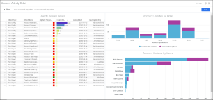
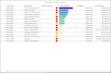
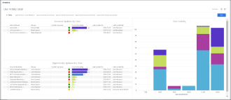
The Account Activity Detail Dashboard shows the following:
-
The details of objects updated within an opportunity plan
-
Details of updates made (Object Updated Details)
-
Cadence of updates (Account Updates by Time)
-
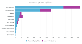
Breakdown of how the team collaborated on the account (Account Updates by Users)
Blind Spots Addressed
-
Which objects in a specific account are being updated?
-
Has the account been updated consistently over the last six months?
-
Are the key maps and plan sections being updated at a regular cadence?
-
Have users been collaborating on this account?
-
Is there enough collaboration on this account?
Drill Down Options
-
Object Updated Details - Table
-
Account Updates by Time - Chart
-
Account Updates by User - Chart
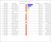
Object Updated Details
-
The colors used in the Update Frequency column are based on the last updated date
| Green |

|
Last Updated Date within last 30 days |
| Amber |

|
Last Updated Date between 31 and 90 days |
|
Red |

|
Last Updated Date > 90 days |
-
The table is sorted by 'Count of Updates' in descending order. Users can sort on other columns
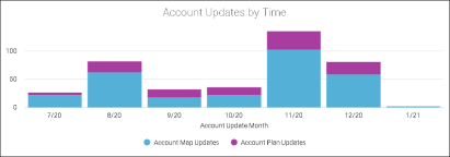
Account Updates by Time
-
Click on bars to drill down to Account Activity Summary table (based on month selected)
-
Definition/Description = logentry table
-
X-axis = Last six months in ascending order and in MM/YY format (e.g. 6/20, 7/20, 8/20, etc.)
-
Y-axis =
-
Account Map Updates (Total map updates in a specific account)
-
-
Account Plan Updates (Total plan object updates in a specific account)
Account Updates by Team Members
-
Click on bars to drill down to User Activity Detail table
-
Definition/Description = logentry table
-
X-axis = User Name
-
Y-axis =
-
Account Map Updates (Total map updates in a specific account)
-
-
Account Plan Updates (Total plan object updates in a specific account)
| Column | Options/Details |
| Opportunity Name |
|
| Owners | Opportunity owner(s) |
| Close Date | Close date |
| Won Amount |
|
Purpose/Value
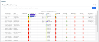
The Account Activity Summary helps answer the following question:
-
What is the health of the opportunities that are due to close in future quarters?
Overview
-
By default, the table is sorted by 'Count of Updates' (descending), followed by 'Revenue Opportunity Status' (descending). Users can sort on other columns
-
When landing on this page by clicking on 'Total Accounts on Usage Home', all accounts are visible
-
When landing on this page by clicking on the KPI 'Updated accounts on Usage Home', the table will show accounts that have been updated at least once
-
When landing on this page by clicking on the KPI 'Account Activity Summary on Usage Home', the table will show accounts that have been updated during the selected month on the chart
Blind Spots Addressed
-
Any risks associated with soon-to-close opportunities?
-
Are high value accounts managed at the right frequency?
-
What are some of the accounts that are not being managed actively?
| Column | Options/Details | ||||||||||||
| Account |
|
||||||||||||
| Owners |
Account Owner(s) |
||||||||||||
| Update Frequency |
Color based on last updated date
|
||||||||||||
| Count of Updates | Total # of updates | ||||||||||||
| Last Updated Date |
Last updated date |
||||||||||||
| Revenue Opportunity Status |
|
||||||||||||
| Account Health Score | Health Score calculation = [Relationship Score (Score set up in map config)] + Task Score + Value Score (Grid or scorecard) / 3 | ||||||||||||
| Relationship Score |
Score configured in map config
|
||||||||||||
| Task Score |
Note: The Task Score is different from the % Past Due Tasks figure located on the Account and Opportunity Status Dashboards. The Task Score is a score out of 100 based on past due tasks. The % Past Due Tasks figure is a calculation. |
||||||||||||
| Last Updated By | Last updated by |
Purpose/Value
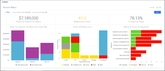
The Account Status Dashboard shows the following:
-
KPIs and trends for a specific account
Revenue Opportunity Status
-
Data source = Open Opportunities & Won Opportunities [Many Column Table (MCT) feeding into Opportunity Summary Analysis (OSA)]
-
Shows total of all open and won opportunities
-
Currency = Revegy Company currency
Relationship Score
-
Data source = Relationship Score configured in map config
-
The colors used in the Relationship Score KPI are based on the following chart:
| Green |

|
≥ 67 |
| Amber |

|
Between 34 and 66 |
|
Red |

|
≤ 33 |
% Past Due Tasks
-
Click on KPI to drill down to Objectives - Task Detail (showing all 'Past Due' tasks for the specific account)
-
Data source = GOA (Internal Action Plan)
-
Calculation = (# of tasks where due date < current date and status is not "Complete" / # of total tasks) * 100
-
This KPI is a percentage with two percentage points
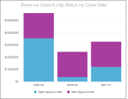
Revenue Opportunity Status by Close Date
-
Data source = Open Opportunities & Won Opportunities (MCT feeding into OSA)
-
X-axis = Expected Close Date from the tables in quarters (e.g. Q1-2020) during Current Year (e.g. CY-1, CY, CY+1, CY+2)
-
Y-axis = Total estimated size
-
Currency = Revegy Company currency
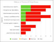
Status of Account Objectives
-
Click on bars to drill down to Objectives - Task Detail
-
Data source = GOA (Internal Action Plan)
-
X-axis = Objectives (Parent level of tasks)
-
Y-axis = # of tasks
-
Bars reflect Task Status based on the following:
-
'Completed' when Status = Complete
-
'In Progress' when Status = In Progress
-
Due Date >= Current Date
-
Past Due when Status <> Complete and Due Date < Current Date
-
-
Legend order = Completed, In Progress, Past Due, Other status
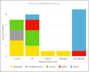
Account Relationship
-
Data source = Account Relationship Map
-
X-axis = Organization Level
-
Y-axis = # of contacts
Purpose/Value
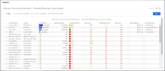
The Account Summary Dashboard - Potential Revenue Opportunities shows the following:
-
Helps identify accounts with highest potential revenue identified
Overview
-
The table is sorted by Potential Revenue Opportunities, descending by default. Users can sort on other columns
-
When landing on this page by clicking on the KPI 'Total Potential Revenue Opportunities', all accounts are visible
-
When landing on this page by clicking on the chart 'Potential Revenue Opportunities by Date Identified', the table will show accounts that have revenue growth ideas (RGI) created in the specific quarter selected. The 'Potential Revenue Opportunities' amount will also be filtered to only show RGI identified in that quarter
Blind Spots Addressed
-
Do our accounts with high-identified potential revenue have red flags (i.e. value or relationship score)?
| Column | Options/Details | ||||||||||||
| Account Name |
|
||||||||||||
| Owners | Account Owner(s) | ||||||||||||
| Potential Revenue Opportunities |
|
||||||||||||
| Revenue Opportunity Status |
|
||||||||||||
| Account Health Score |
Health Score calculation = [Relationship Score (Score set up in map config)] + Task Score + Value Score (Grid or scorecard) / 3
|
||||||||||||
| Value Score |
Grid or scorecard score
|
||||||||||||
| Relationship Score |
|
||||||||||||
| Task Score |
Note: The Task Score is different from the % Past Due Tasks figure located on the Account and Opportunity Status Dashboards. The Task Score is a score out of 100 based on past due tasks. The % Past Due Tasks figure is a calculation. |
||||||||||||
| Last Updated Date | Last updated date | ||||||||||||
| Last Updated By | Last updated by |
Purpose/Value
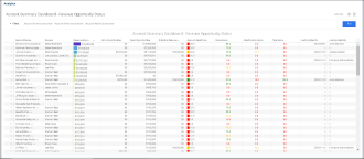
The Account Summary Dashboard - Revenue Opportunity Status shows the following:
-
Helps identify accounts with highest potential revenue identified
Overview
-
The table is sorted by Revenue Opportunity Status, descending by default. Users can sort on other columns
-
When landing on this page by clicking on the KPI 'Revenue Opportunity Status', all accounts are visible
-
When landing on this page by clicking on the chart 'Revenue Opportunity Status by Close Date', the table will show accounts that have open or won opportunities that are expected to close in the quarter selected
-
When landing on this page by clicking on the KPI '% Healthy Accounts', only accounts where the health score ≥ 67 is shown
-
When landing on this page by clicking on a specific health score range in the chart 'Accounts by Health Score Range', only accounts in the selected range are shown
Blind Spots Addressed
-
User is able to identify if accounts with high-identified potential revenue have red flags (i.e. value, relationship score) and perform further analysis
Drill Down Options
-
Revenue Opportunity Status - KPI
-
Relationship Score - KPI
-
% Incomplete Tasks - KPI
-
Revenue Opportunity Status by Close Date - Chart
-
Account Relationship - Chart
-
Status of Account Objectives
| Column | Options/Details | ||||||||||||
| Account Name |
|
||||||||||||
| Owners | Account Owner(s) | ||||||||||||
| Revenue Opportunity Status |
|
||||||||||||
| Won Opportunities | Won opportunities | ||||||||||||
| Open Opportunities | Open opportunities | ||||||||||||
| Potential Amount |
|
||||||||||||
| Account Health Score |
Health Score calculation = [Relationship Score (Score set up in map config)] + Task Score + Value Score (Grid or scorecard) / 3
|
||||||||||||
| Value Score |
Grid or Scorecard score
|
||||||||||||
| Relationship Score |
Score configured in map config
|
||||||||||||
| Task Score |
Note: The Task Score is different from the % Past Due Tasks figure located on the Account and Opportunity Status Dashboards. The Task Score is a score out of 100 based on past due tasks. The % Past Due Tasks figure is a calculation. |
||||||||||||
| Last Updated Date | Last updated date | ||||||||||||
| Last Updated By | Last updated by |
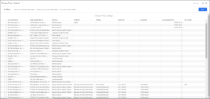
Purpose/Value
The Close Plan Detail shows the following:
-
Helps identify tasks that are lagging behind
Overview
-
Users that land on this dashboard after clicking the 'Close Plan Status' from the Opportunity Status Dashboard will filter this table on Opportunity Name and Status
Blind Spots Addressed
-
User is able to identify the key tasks that are past due
| Column | Options/Details |
| Account Name |
|
| Opportunity Name |
|
| Owners |
Opportunity Owner(s) |
| Activity | Activity |
| Status | Same as status in Revegy application |
| Due Date | Due date |
| Assigned To | Assigned to |
| Last Updated On | Last updated on date |
| Comments | Comments |
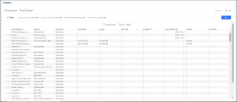
Purpose/Value
The Objectives - Task Detail shows the following:
-
Helps identify objectives / tasks that are lagging behind
Overview
-
Users that land on this dashboard after clicking 'Objectives Status' from the Account Status Dashboard will filter this table on Account Name and Status
Blind Spots Addressed
-
User is able to identify if key objectives and the key tasks are past due
| Column | Options/Details |
| Account Name |
|
| Owners | Account Owner(s) |
| Objective | Objective |
| Task Name | Task Name |
| Task Status | Same as status in Revegy application |
| Due Date | Due date |
| Assigned To | Assigned to |
| Last Updated Date | Last Updated On |
| Priority | Priority |
| Comments | Comments |
Purpose/Value
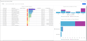
The Opportunity Activity Detail shows the following:
-
Which objects in a specific opportunity are being updated?
-
This dashboard shows the details of objects updated within an opportunity plan
Overview
-
The table is sorted by 'Count of Updates' in descending order. Users can sort on other columns
-
This page is landed upon by the user after clicking on an 'Opportunity Name' in the 'Top 10 Opportunities' table (located in the Usage Dashboard)
-
This page is landed upon by the user after clicking on an 'Opportunity Name' in the 'Opportunity Activity Summary' Dashboard
Blind Spots Addressed
-
Has the opportunity been updated consistently over the last six months?
-
Are the key maps and plan sections being updated at a regular cadence?
-
Have users been collaborating enough on this opportunity?
Drill Down Options
-
Object Updated Details - Table
-
Opportunity Updates by Time - Chart
-
Opportunity Updates by Team Member - Chart
Object Updated Details
-
Filter by Object Name
-
Object Type = Type of Object - Plan object, Map
-
Object Name = Object name
-
Update Frequency - Colored based on the last updated date
| Green |

|
Last Updated Date within last 30 days |
| Amber |

|
Last Updated Date between 30 and 60 days |
|
Red |

|
Last Updated Date > 60 days |
-
Count of Updates = Total # of updates
-
Last Updated Date = Last Updated Date
-
Last Updated By = Last Updated By
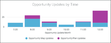
Opportunity Updates by Time
-
Data source = logentry table
-
X-axis = Last six months in ascending order and in MM/YY format (e.g. 6/20, 7/20, 8/20, etc.)
-
Y-axis =
-
Opportunity Map Updates - Total map updates in a specific opportunity
-
Opportunity Plan Updates - Total plan object updates in a specific opportunity
-
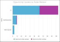
Opportunity Updates by Team Members
-
Data source = logentry table
-
X-axis = User Name
-
Y-axis =
-
Opportunity Map Updates - Total map updates in a specific opportunity
-
Opportunity Plan Updates - Total plan object updates in a specific opportunity
-
Purpose/Value
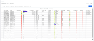
The Opportunity Activity Summary shows the following:
-
Helps identify the health of opportunities that are due to close in the next couple of quarters
Overview
-
By default, the table is sorted by 'Count of Updates' in descending order, then by 'Close Date' in ascending order, and then by 'Deal Size' in descending order. Users can sort on other columns
-
When landing on this page by clicking on 'Total Opportunities' (located on the Usage Dashboard), all opportunities are visible
-
When landing on this page by clicking on the KPI 'Updated Opportunities' (located on the Usage Dashboard), the table will show opportunities that have been updated at least once
-
When landing on this page by clicking on the KPI 'Opportunity Activity Summary' (located on the Usage Dashboard), the table will show opportunities that have been updated during the selected month on the chart
Blind Spots Addressed
-
Any risks associated with soon-to-close opportunities
-
Are high value opportunities managed at the right frequency?
-
What are some of the opportunities that are not being managed actively?
Drill Down Options
-
Object Updated Details - Table
-
Opportunity Updates by Time - Chart
-
Opportunity Updates by Team Member - Chart
| Column | Options/Details | ||||||||||||
| Opportunity Name |
|
||||||||||||
| Owner | Opportunity Owner(s) | ||||||||||||
| Update Frequency |
|
||||||||||||
| Count of Updates | Total # of updates | ||||||||||||
| Last Updated Date | Last updated date | ||||||||||||
| Deal Stage | Opportunity stage | ||||||||||||
| Close Date | Estimated close date | ||||||||||||
| Deal Size | Estimated size | ||||||||||||
| Opportunity Health Score |
|
||||||||||||
| Value Score |
Based on grid or scorecard score
|
||||||||||||
| Relationship Score |
Score configured in map config
|
||||||||||||
| Task Score |
Note: The Task Score is different from the % Past Due Tasks figure located on the Account and Opportunity Status Dashboards. The Task Score is a score out of 100 based on past due tasks. The % Past Due Tasks figure is a calculation. |
||||||||||||
| Last Updated By | Last updated by |
Purpose/Value
The Opportunity Status Dashboard answers the following questions:
-
What are the KPIs and trends for a specific account?
-
What are the KPIs for this opportunity?
-
How are the relationships with this opportunity's contacts distributed?
-
Do I / Does my team have strong relationships with key contacts that will impact the opportunity?
-
Are the tasks in the Close Plan (or joint success plan) being worked on regularly for this opportunity?
Blind Spots Addressed
-
Is the opportunity on schedule to close on the expected date?
-
Are there ways to improve the health of the opportunity in order for it to close successfully?
-
How can we influence the preference of the key influencers?
-
Are there any key tasks where we are lagging behind or making no progress?
Opportunity Details
-
Opportunity Name = Name of the opportunity
-
Owners = Opportunity owner(s)
-
Deal Stage = Opportunity stage
-
Forecast Category = Forecast Category from opportunity
-
Close Date = Expected close date
-
Deal Size = Estimated size
-
Opportunity Health Score = [Relationship Score (Score set up in map config) + Task Score + Qualification Score (Grid or scorecard)] / 3 (see table below for color significance)
-
Value Score - Grid or scorecard score (see table below for color significance)
-
Relationship Score - Score configured in map config (see table below for color significance)
| Green |

|
≥ 67 |
| Amber |

|
between 34 and 66 |
| Red |

|
≤ 33 |
-
Task Score = Default Sort Descending -2 (see table below)
-
Note: The Task Score is different from the % Past Due Tasks figure located on the Account and Opportunity Status Dashboards. The Task Score is a score out of 100 based on past due tasks. The % Past Due Tasks figure is a calculation.
-
| Green |

|
100 | No past due tasks |
| Amber |

|
33 | There are past due tasks 1-7 days old |
| Red |

|
0 | There are past due tasks older than 1 week |
-
Last Updated On = Last updated date
-
Last Updated By = Last updated by
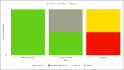
Influence Map Status
-
Data source = Opportunity Influence Map
-
X-axis = Influencer Role
-
Y-axis = # of contacts
-
Bars can be broken down by preference
Status of Engagement Plan
-
Click on a section in the chart to drill down to the Close Plan Detail dashboard for a view of tasks with the selected status for the specific opportunity
-
Data source = Internal Close Plan
-
Y-axis = # of tasks
-
Bars are broken down by Task Status based on the following:
-
Completed - When Status = Complete
-
In Progress - When Status = In Progress and Due Date >= Current Date
-
Past Due - When Status <> Complete and Due Date < Current Date
-
-
Legend order - Completed, In Progress, Past Due, Other status
Purpose/Value
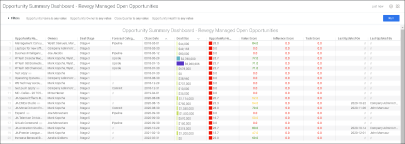
The Opportunity Summary Dashboard – Revegy Managed Open Opportunities shows the following:
-
Helps identify the health of all open opportunities
Overview
-
By default, the table is sorted by 'Close Date' in ascending order, then by 'Deal Size' in descending order. Users can sort on other columns
-
When landing on this page by clicking on the KPI 'Revenue Opportunity Status', all accounts are visible
-
When landing on this page by clicking on the chart 'Revenue Opportunity Status' (by Close Date), the table will show accounts that have open or won opportunities that are expected to close in the quarter selected
-
When landing on this page by clicking on the KPI '% Healthy Opportunities', only opportunities with health score ≥ 67 is shown
-
When landing on this page by clicking on a specific health score range in the chart 'Opportunities by Health Score Range', only opportunities in the selected range are shown
Blind Spots Addressed
-
Any risks associated with soon-to-close opportunities
| Column | Options/Details | ||||||||||||
| Opportunity Name |
|
||||||||||||
| Owners | Opportunity owner(s) | ||||||||||||
| Deal Stage | Opportunity stage | ||||||||||||
| Forecast Category | Forecast Category from the opportunity | ||||||||||||
| Close Date | Expected close date | ||||||||||||
| Deal Size | Estimated size | ||||||||||||
| Opportunity Health Score |
|
||||||||||||
| Value Score |
|
||||||||||||
| Relationship Score |
|
||||||||||||
| Task Score |
Note: The Task Score is different from the % Past Due Tasks figure located on the Account and Opportunity Status Dashboards. The Task Score is a score out of 100 based on past due tasks. The % Past Due Tasks figure is a calculation. |
||||||||||||
| Last Updated Date | Last updated date | ||||||||||||
| Last Updated By | Last updated by |
Purpose/Value
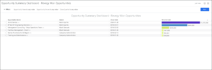
The Opportunity Summary Dashboard – Revegy Won Opportunities shows the following:
-
Helps identify won opportunities with highest deal size
Overview
-
The table is sorted by Won Amount, descending by default. Users can sort on other columns
-
When landing on this page by clicking on the KPI 'Revegy Won Opportunities', all opportunities are visible
-
When landing on this page by clicking on the chart 'Won Opportunities (by Close Date)', the table will show opportunities that have a close date in the specific quarter selected
-
Only shows opportunities where Stage = Closed Won
| Column | Options/Details |
| Opportunity Name |
|
| Owners | Opportunity owner(s) |
| Close Date | Expected close date |
| Won Amount |
|
Purpose/Value
The User Activity Detail shows the following:
-
This dashboard shows the details of objects updated within an opportunity plan
-
Details of account updates made by user (Account Updates By User)
-
Details of opportunity updates made by user (Opportunity Updates By User)
-
Cadence of updates (User Activity)
Overview
-
Filtered view based on 'User Name'
-
This page is landed upon by the user when clicking on 'Account Name' in the Top 10 Users visualization (located in the Usage Dashboard)
-
This page is landed upon by the user when clicking on 'Opportunity Name' in the Top 10 Users visualization (located in the Usage Dashboard)
-
This page is landed upon by the user when clicking on the 'User Name' in the User Activity Summary
-
This page is landed upon by the user when clicking on 'Opportunity Name' in the Opportunity Activity Summary
Blind Spots Addressed
-
Are the key maps and plan sections being updated at a regular cadence?
-
Is there enough collaboration on this opportunity?
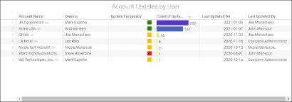
Account Updates by User
-
Click on the Account Name to drill down to the Account Activity Detail dashboard
-
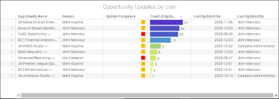
Update Frequency = Colored based on the last updated date
| Green |

|
Last Updated Date within last 30 days |
| Amber |

|
Last Updated Date between 31 and 90 days |
|
Red |

|
Last Updated Date > 90 days |
-
The table is sorted by Count of Updates in descending order. Users can sort on other columns
User Activity
-
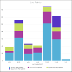
Click on any bar or date to open the User Activity Summary detailed view (for the selected month)
-
Update Frequency = Colored based on the last updated date
| Green |

|
Last Updated Date within last 30 days |
| Amber |

|
Last Updated Date between 31 and 90 days |
|
Red |

|
Last Updated Date > 90 days |
-
Count of Updates: Total # of updates
-
The table is sorted by Count of Updates in descending order. Users can sort on other columns
Opportunity Updates by User
-
Click on the Account Name to drill down to the Opportunity Activity Detail dashboard
-
Definition/Description = logentry table
-
X-axis = Last six months in ascending order and in MM/YY format (e.g. 6/20, 7/20, 8/20, etc.)
-
Y-axis =
-
Account Map Updates (Total map updates in a specific account)
-
Account Plan Updates (Total plan object updates in a specific account)
-
Opportunity Map Updates (Total map updates in a specific opportunity)
-
Opportunity Plan Updates (Total plan object updates in a specific plan)
-
Purpose/Value
The User Activity Summary shows the following:
-
The health of opportunities that are due to close in the next couple of quarters
-
Details of updates made (Opportunity Updates By User)
-
Cadence of updates (Account Updates by Time)
-
Breakdown of how the team collaborated on the account (Account Updates by Team Member)
Overview
-
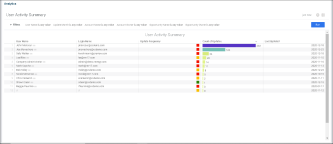
The table is sorted by 'Count of Updates' in descending order. Users can sort on other columns
-
When landing on this page by clicking on 'Total Users' (located on the Usage Dashboard), all users are visible
-
When landing on this page by clicking on the KPI 'Active Users' (located on the Usage Dashboard), the table will show users that have made updates at least once
-
When landing on this page by clicking on the chart 'User Activity Summary' (located on the Usage Dashboard), the table will show users that have been updated during the selected month on the chart
Blind Spots Addressed
-
Any risks associated with soon-to-close opportunities
| Column | Options/Details | |||||||||
| User Name |
|
|||||||||
| Login Name | Login name | |||||||||
| Update Frequency |
|
|||||||||
| Count of Updates |
|
|||||||||
| Last Updated Date | Last updated date |
